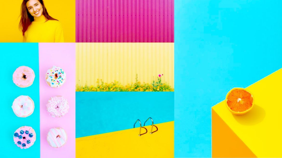
The use of colour blocking in photography might be challenging. The photography method known as “color blocking” is based on the idea that more striking images are more effective. Utilizing colours that are bright and lively is the most important thing. You decide on two or three colours and utilise each of them quite heavily. The colours almost leap out of the photo, and they are so vibrant that you can practically hear them. Photography using colour blocking is not for the faint of heart. It’s a photographic style that believes that being bold is better. There is no place
Category: Photography Colour Guide
10 Tips For Using Vibrant Colors For Colorful Photography
Vibrant colors are easy to find, especially during the warmer months. This is a great excuse to deepen your knowledge of colors, photography, and how they work together. For The Best Results, Adjust Your Camera Settings Pay attention to your white balance when you photograph vibrant colors. The wrong adjustment will make your photos look unflattering. Or it can turn a simple color into a completely different one. There’s no perfect formula for white balance. It all depends on where you shoot. If you’re working with warm artificial light, you’ll have to make your photos look colder. Most cameras come
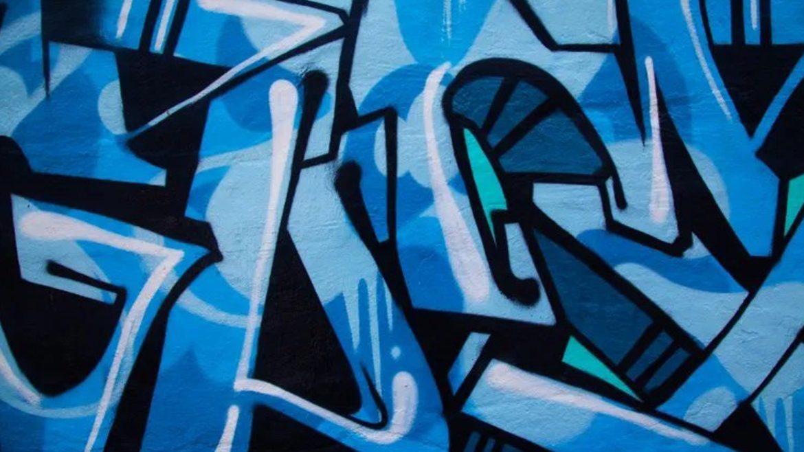
Mastering Color: The Psychology Of The Color Blue And Its Use In Photography
As one of the three primary colors in traditional colour theory and the RGB colour model, blue’s greatest impact is in its capacity to convey strong emotion. Painter Vincent van Gogh once said “I never get tired of the blue sky”, his fascination proving integral to many of his most famous paintings. In this article, we’ll have a detailed look at the history of blue in visual arts and what it means for your photography. THE PSYCHOLOGY OF BLUEColor has a profound effect on our psychology. Rayleigh scattering, an optical phenomenon that causes the sea and sky to appear blue,
Amazing Guide To Create Colorful Eye Catching Photographs Without Post Processing
There are a lot of really great tools to use in Photoshop, or Lightroom, to get the colors in your photos to pop, creating a more vibrant portrait. But, did you know that you can create color popping portraits, before you even open them for post-processing? It’s true! By incorporating some of the simple things below, before you take a photo, the color in your portraits will really stand out, and help you create eye catching photographs. Make Sure Your Background Colors Complement The Subject Understanding what colors complement each other, will really help the colors in your portraits pop.
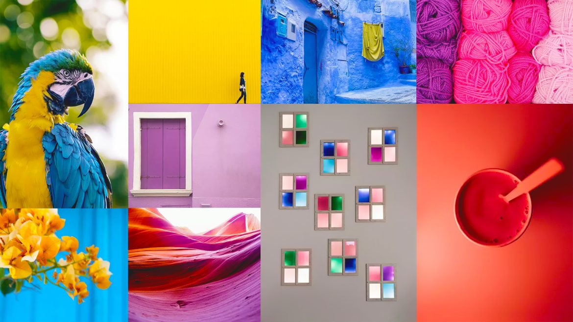
How To Use Complementary Colors In Photography
Some colors go together like chalk and cheese. But, with a little research, some practice and the use of your ‘eye’, you can find complementary colors. Red and green will always go together. It’s the law. But, red and orange are a big no-no. They just do not work together. Look at our some stunning examples to set you on the right path. Red And Green I often hear that red and green is not a pleasing combination. To those who think that I would like to show some Christmas decorations. Or a strawberry. Red and green is a common
5 Basic Mistakes To Avoid When You Shoot Black And White Photography
Black and white photography has been around for nearly 180 years, ever since Louis Daguerre introduced the daguerreotype process to the world. It is still hugely popular despite the rise and ease of color photography. And yet, whenever I look at other people’s black and white photos, I see the same mistakes over and over. Are you making any of these? Let’s find out! Shooting In JPEG Format Ouch! This is a big one. It’s the single worse thing you could do. The Difference Between RAW And JPEG To understand why, you need to appreciate the difference between Raw files
Mastering Color – The Psychology Of The Color Purple And Its Use In Photography
Purple has had a long history in visual arts. From prehistoric to modern artworks, purple has come to represent aspects of religion, royalty and status. In this article, we’ll look back on the history of the color purple, its evolution and its impact in the context of modern visual art. THE PSYCHOLOGY OF PURPLEIn the traditional color wheel used by artists, violet and purple are placed between red and blue. Purple takes up the space closer to red, between crimson and violet. Violet is positioned closer to blue. Despite this, both violet and purple are often placed under the one
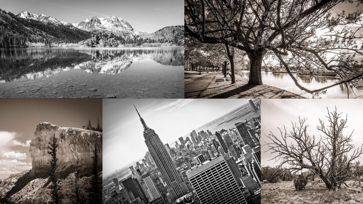
What Is The Difference Between Grayscale Vs Black & White Vs Monochrome
If you are starting to take black and white images or are just looking at it as the next step in your photography, you’ve probably come across these three terms and wondered, “What is the difference?” The quick answer is, “Not very much.” But, let’s take a closer look at the various terms and their differences. Black And White Photography Once upon a time, there was just a “film.” It was all black and white; that was the only option. Google “old film box” and you’ll see it will simply say “film” on the box without any mention of color
Mastering Color – The Psychology Of The Color Orange And Its Use In Photography
Situated between yellow and red on the visible spectrum, orange has a long history in visual culture. Dubbed the “happiest color” by Frank Sinatra, we’ll take a look at the color orange and its significance from antiquity to contemporary art. THE PSYCHOLOGY OF ORANGENamed after the citrus fruit, the word orange is derived from the old French phrase orenge. The earliest use of the word orange in English dates back to the 1300s. However, orange’s use as the name of a color didn’t occur until the early 1500s. Before that, orange was simply called yellow-red. The distinctive orange color of
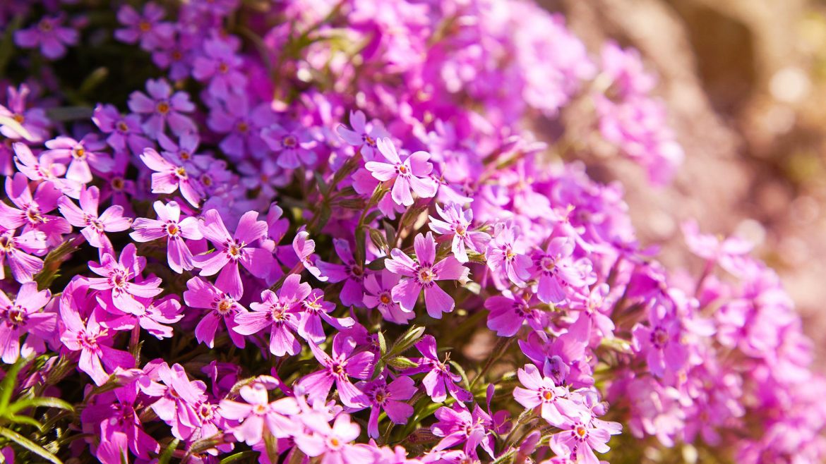
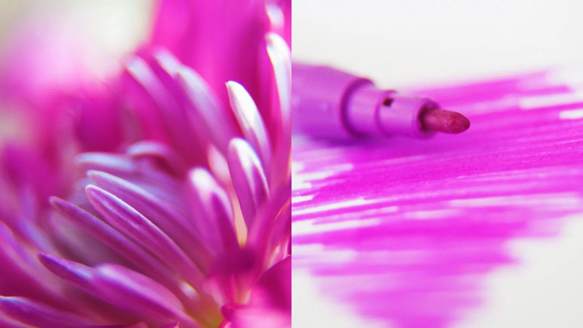
Mastering Colour: The Psychology Of The Colour Pink And It’s Use In Photography
From the Renaissance to contemporary art, pink has endured as a color of emotional versatility. In this edition of the Mastering Color Series, let’s take a look into the color pink and its role within the history of visual arts. THE PSYCHOLOGY OF PINKThe English word pink derives its name from flowers of the Dianthus genus. A combination of red and white, pink can be raucous and racy, or delicate and subtle. Buoyant light pinks describe playfulness, youth, kindness and affection. Darker shades of pink denote passion, love, energy, eroticism and confidence. However, too much pink can be a bad

How To Take Professional Black And White Headshots
In the acting and modeling world, black and white head shots are commonplace in portfolios. If you want to diversify your photography portfolio, it would be a good idea to add this skill to it. Head shots are laid back and can be a lot of fun; you can just play around, trying to come up with something creative. Why Black And White Headshots? This is a question I asked myself when I was approached to take some of these photos. It’s a very good question really, with a variety of possible answers: Firstly, there’s the idea that, because the
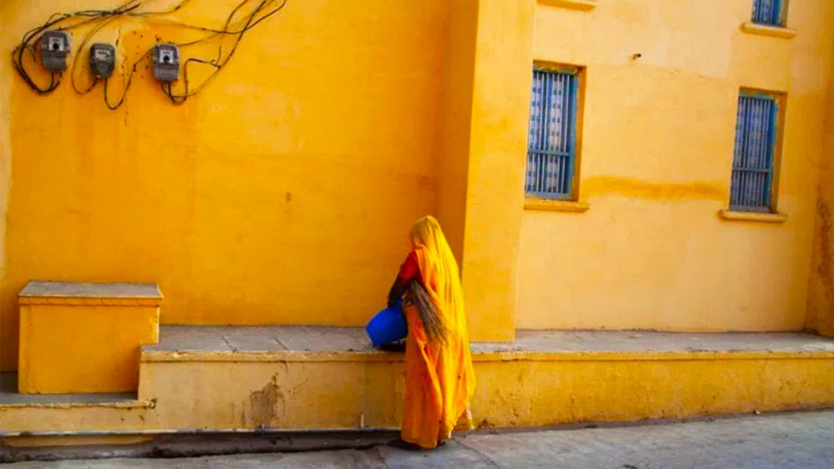
Mastering Color: The Psychology Of The Color Yellow And Its Use In Photography
In her diary, Frida Kahlo once wrote, “Yellow: madness, sickness, fear (part of the sun and of joy).” As one of the oldest pigments used by humans, the spectrum of attributes associated with yellow makes it an enduring presence in art and design. In this article, we’ll look at the evolution and artistic impact of yellow from prehistoric to contemporary visual arts. THE PSYCHOLOGY OF YELLOWAs one of yellow’s oldest embodiments, the sun and yellow are inextricably linked, the qualities of the sun (warmth, energy, and radiance) reflected in human perceptions of the color yellow. Throughout history, the sun came