Photography was invented in 1839 as a black and white medium. Finicky and cumbersome, most proponents of photography were more concerned with perfecting the photographic process without the added complexity of color. Some pioneers endured, creating new methods to convey the colored photographic image. But it was only in the 1930s when companies like Kodak and Agfa began introducing a consumer-based color film that color photography started to become widely available and relatively affordable.
The invention and widespread use of color film had a significant impact on photography. Modern photographers could now depict a more realistic rendition of a scene, conveying the world in colors similar to that seen through the average human eye. But color photography had another purpose too. Photographers could now couple imagery with the emotional charge of color a lot more readily.
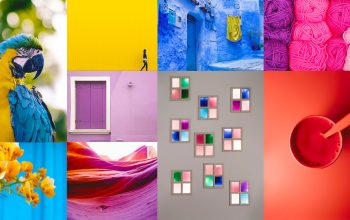
Over the course of history, humans have forged strong associations with colors. And while some associations are experiential, others speak to our evolution and the history of visual arts. In this series of articles, we’ll take a look at the history of different colors, how they have shaped our way of seeing, and what it means for your photography.

THE PSYCHOLOGY OF RED
Color has a significant impact on our perceptions, emotions and physicality. Our earliest ancestors drew associations between red and the color of our blood, cultivating a strong visual link between red and danger, violence, and life. Humans evolved to prioritize red as a color of immediacy, warning and opportunity. For example, the appearance of fire links red to warmth and light, but also to destruction.
Because it commands our attention, red brings text and subjects to the foreground of an image. Red is also the international standard for stop signs and traffic lights. In nature, red Autumn leaves and vibrant sunsets appeal to our sense of time and season. Perhaps tied to the color of red roses – a flower traditionally associated with romance – red symbolizes passion, love, and sex. Red appeals to our taste buds too, with foods like strawberries, apples, cherries, tomatoes, and peppers all colored by forms of carotenoids – vibrant red pigments that assist photosynthesis.

Red has different associations in different cultures and beliefs. In some parts of Africa, red is a color of mourning, representing death. Traditionally worn at funerals, weddings, and New Year festivities, red symbolizes good luck, happiness, and prosperity in China. In Thai tradition, red is the color for Sunday, associated with Surya, a solar god. In the Indian subcontinent, red signifies purity, fertility, wealth, beauty, and the goddess Lakshmi. And in Japan, red is the traditional color of heroism.

Informed by the enduring presence of red in visual arts, these inherent associations (and more) sculpt the way a viewer reads an image.
EVOLUTION OF THE COLOR RED
Despite its numerous forms, red has held a constant place of significance throughout history. From Ocher to Cadmium Red, the evolution of red stems from our ancient reverence for the commanding hue.
Ocher: Ocher is a naturally occurring pigment that ranges in color from yellow to deep orange or brown. When combined with hematite, ochre takes on a red tone. Dated around 36,000 years old, the red bison on the cave walls of Altamira in Spain are among some of the oldest examples of red being used in visual arts.

Cinnabar: Cinnabar, a natural mercuric sulfide, ranges in hue from deep brick to scarlet. Though highly toxic, Romans lorded over the brilliance of the red pigment, using it extensively in decoration. Cinnabar features prominently in the murals of upper-class villas in Pompeii. Starting with the Song dynasty, the Chinese employed cinnabar in elaborately carved lacquerware.
Vermilion: Ancient writers used the term vermilion to describe the pigment made from grinding up cinnabar. But vermilion also refers to a synthetic version of the color, invented in China. Renaissance paintings feature the latter regularly. Renowned Renaissance artist Titian is known for his luxuriant vermilion accents.

Minium: Romans made minium, also known as red lead, by heating white lead to extremely high temperatures. Contrasting well against gold and marble, the Romans used minium mainly for inscriptions. Medieval illustrators made use of the pigment in their illuminated manuscripts but it was particularly popular with the Mugal artists from India and Persia in the 17th and 18th centuries.
Vincent van Gogh was an ardent user of minium. However, it has since been discovered that minium whitens under light, and some of van Gogh’s works have had their red accents fade as a consequence.
Carmine: During their conquest of Mexico in the early 16th century, Spanish conquistadors were taken aback by the vibrant fabrics and face paint of the Aztecs. Derived from cochineal bugs, the Spanish soon started shipping large quantities of ‘Spanish Red’ to Europe. Artists quickly adopted carmine to adorn their elaborate dramas. However, like minium, carmine also had a tendency to fade, especially in sunlight. Cosmetics and red food coloring continue to employ carmine today.
Cadmium Red: In 1817, a German chemist discovered a new element, cadmium, which became the basis for shades of yellow and orange paint. However, it took another 93 years before cadmium red became available commercially in 1910. Intense and lightfast, Henri Matisse was one of the first prominent users of the pigment. Other artists who adopted cadmium red include Edvard Munch, Francis Bacon, and Clyfford Still.

Since the invention of cadmium red, technological advances have created a broad range of synthetic pigments and chemical processes for producing red pigment. Easier preparation and application, better archival qualities, and a wide variety in shades have all become standard for red in paint, dyes, and inks today.
RED IN VISUAL ARTS
Because of its continuous presence in art history, the concept of red has evolved over time, encompassing new significance and meaning. We can’t be entirely sure what significance red held for our ancient ancestors. However, we can assume that at the very least that the use of red elevated the drawing from the rock, making the image appear more dimensional.

Medieval artists associated red with Pentecost, the Holy Spirit, and the blood of Christian martyrs. In Renaissance painting, red exploited the gaze of the viewer, cloaking Christ, the Virgin Mary, or other substantial figures.
Baroque art saw deep and luminous reds conveyed in spectacular drama. Later, pre-Raphaelite artists used shades of red and orange to paint the flowing locks of women and to draw attention to the symbolism nested within their artworks.

Impressionist and post-impressionist artists used reds to convey light or accent detail. Fauvists, however, crammed abundantly vibrant reds into scenes and portraits with almost violent tenacity. Only a few years later, abstract art abandoned objective subject matter. Used to punctuate, irritate, and philosophic, abstract artists energized the viewer or engulfed them all together in fields of ravenous red.
RED IN PHOTOGRAPHY
With the advent of color photography, the creative possibilities for photographers flourished. The radical medium allowed photographers to depict color close to as it was in the field. Furthermore, inherent color associations carried over to color photography. Red’s enduring qualities allowed photographers to communicate visual cues based in evolution and in art.
As an early pioneer in color photography, Marie Cosindas‘ dispersal of reds throughout her still lifes and portraits resemble the technique of baroque still lifes. William Eggleston‘s famous photograph, The Red Ceiling, uses red as a stark undercurrent to a seemingly ordinary setting. In Saul Leiter’s dynamic renderings, red adds drama to the theater of the urban landscape. Images like Dust Storm and Red Boy and Holi Festival by Steve McCurry document the history and materiality of red in art and culture. McCurry’s most well-known photograph, Afghan Girl depicts a young girl whose piercing eyes are further accentuated by the striking red scarf framing her face.

Nan Goldin’s use of red conveys atmospheric tension as if the air itself were dense with color. Richard Mosse’s series Infra depicts the Congo in infra-red, rendering the green landscape in shades of pink and red, re-framing the nature of photojournalism.
The use of red isn’t limited to color photography either. Red filters (applied on/in-camera or in post-production) absorb blue and green light, enhancing contrast. Famous landscape photographer Ansel Adams used red filters to dramatic effect, darkening the blue skies featured in his abundant vistas.
CONCLUSION
Faber Birren, an American author and consultant on color theory once said “red is the passionate and ardent hue of the spectrum, marking the saint and the sinner, patriotism and anarchy, love and hatred, compassion and war.” Red has been regularly utilized throughout history to denote concepts and experiences. Status, physicality, anger, warmth, love and danger are all aspects that have been characterized as having associations with red.
With the invention of color photography, red carried over to film and then digital media. And while it has different meanings in different cultures, red’s prominence throughout art history is a testament to its emotional and visual impact today.
originally posted on digital-photography-school.com by Megan Kennedy